
Regression models are most studied and best understood models in statistics. Regression and correlation are closely related and were invented by Francis Galton, the famous Victorian statistician.
In linear regression, we model the relationship between two variables – dependent and independent variable and we represent the data by drawing a line through it. Before fitting the data and deciding whether we are going to use linear regression or something else, we need to check whether there is a relationship between variables. For this, a scatterplot can be helpful.
If a scatterplot doesn’t show any decreasing or increasing of data, then fitting the linear regression to data will not be useful. To determine the association between the two variables and how well the model fits the observations, we use the correlation coefficient, which has values between 

Most machine learning algorithms can be divided into supervised and unsupervised learning. In supervised learning, we already know what our output should look like. We can categorize supervised learning further, into regression and classification problems. In unsupervised learning, we have no knowledge of how our output should look like. I will talk about the machine learning methods for unsupervised learning later in this blog.
Linear regression is a form of a supervised learning algorithm where the output is a continuous function (a number), while in categorisation problems, the output is discrete.
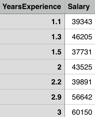
Let’s take a look at an example. Suppose we have a dataset with salary and years of experience columns in it (two variables where the “salary” is the dependent variable – the one we are trying to predict and “years of experience” is the independent variable).
Suppose the number of data points in the file is 


and the goal is to find the linear regression line
,
or in our case

Least squares is the method which calculates the best line to fit the data by minimizing the sum of the squares of distances from each point to the regression line. Since the distances are squared, we can be sure that we will get positive values and that there will be no cancellation between data points.

Figure taken from http://mathworld.wolfram.com/LeastSquaresFitting.html
In the figure above you can see what I mean by “distance of data points from the regression line”. The least squares method is minimizing the following

where 


Correlation of 
The correlation coefficient is given by

where


and


The relationship between the linear regression line and the correlation coefficient is given by

Let’s try this in Python. First, we want to examine our data and see how scatterplot looks like. In Python we can achieve this with the following snippet of code:
import matplotlib.pyplot as plt
import pandas as pd
import numpy as np

data = pd.read_csv('salary_data.csv')

x = df.iloc[:, :-1].values
y = df.iloc[:, 1].values

plt.scatter(x, y, color='blue')
plt.show()
The important thing to notice here is that x is the matrix (the matrix of features of the independent variables(s), while y is a vector of the dependent variable).
This will give us the following figure:
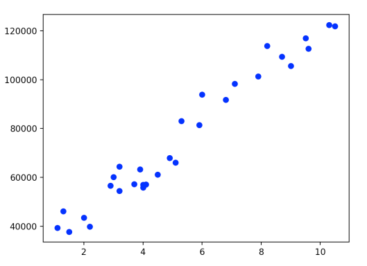
We can see that the scatterplot clearly shows increasing of data and that we can pull the ‘straight line’ through it to approximate it. Now let’s calculate the correlation coefficient. We can use different correlation coefficients, for example, Pearson, Kendall, Spearman. For the purposes of this blog I will use the Pearson correlation coefficient, which with Pandas library we can calculate easily:
corr = df.corr(method='pearson')
This gives us the correlation matrix between the columns:
                        YearsExperience           Salary

YearsExperience           1.000000               0.978242

Salary                    0.978242               1.000000
From this, we can see that correlation between variables is very high – variables are highly associated. There are statistical methods which can be used to determine the statistical significance of the correlation coefficient, but I will talk more about that later.
Similarly, as in Multiple Linear Regression in Python, one of the possibilities to do Linear Regression in Python follows ([1]). First, we need to split the dataset into the training set and the test set which is usually done using the 25-30%, 70-75% ratio. How to chose the data for the test and the training sets is another story and I will talk more about it in later posts. For now, I will do it randomly using 1/3 ratio with the sklearn library.
from sklearn.cross_validation import train_test_split
x_train, x_test, y_train, y_test = train_test_split(x, y, test_size = 1/3.0, random_state = 0)
Now we can fit the linear regression to the training set.
from sklearn.linear_model import LinearRegression
regressor = LinearRegression()
regressor.fit(x_train, y_train)
Finally, we can predict the results
y_pred = regressor.predict(x_test)
and visualize the training and test sets results:
plt.scatter(x_train, y_train, color = 'red')
plt.plot(x_train, regressor.predict(x_train), color = 'blue')
plt.title('Salary vs Experience (Training set)')
plt.xlabel('Years of Experience')
plt.ylabel('Salary')
plt.show()


plt.scatter(x_test, y_test, color = 'red')
plt.plot(x_train, regressor.predict(x_train), color = 'blue')
plt.title('Salary vs Experience (Test set)')
plt.xlabel('Years of Experience')
plt.ylabel('Salary')
plt.show()
The first plot gives us the following figure.

The blue line represents predicted values and the red dots represent real values. We used the training set to make our model ‘learn’ about the data and now we can test how well out model can predict ‘new’ data from the test set.
From the second plot, we get
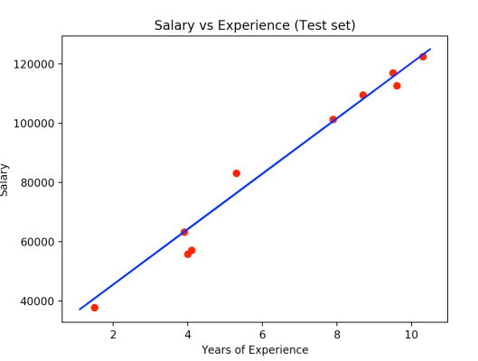
Here the red dots are observation points of the test set and we can see that our model made some really good predictions.
Resources:
- https://www.udemy.com/machinelearning/learn/v4/overview
- http://www.stat.yale.edu/Courses/1997-98/101/linreg.htm
- https://www.coursera.org/learn/regression-models/lecture/CRfJS/linear-least-squares
- http://galton.org/essays/1880-1889/galton-1886-jaigi-regression-stature.pdf
- http://sphweb.bumc.bu.edu/otlt/mph-modules/bs/bs704_multivariable/bs704_multivariable5.html
